You can translate this comic via our online interface.
Translating helps the artist to be more visible, and shows your interest and gratitude.
Dedicated translators will be rewarded with Golds.
 English :
COMICS / MANGAS | AUTHORS | COMMENTS
English :
COMICS / MANGAS | AUTHORS | COMMENTS
 Español :
COMICS / MANGAS | AUTHORS | COMMENTS
Español :
COMICS / MANGAS | AUTHORS | COMMENTS
 Français :
COMICS / MANGAS | AUTHORS | COMMENTS
Français :
COMICS / MANGAS | AUTHORS | COMMENTS
 日本語 :
COMICS / MANGAS | AUTHORS | COMMENTS
日本語 :
COMICS / MANGAS | AUTHORS | COMMENTS
 Русский :
COMICS / MANGAS | AUTHORS | COMMENTS
Русский :
COMICS / MANGAS | AUTHORS | COMMENTS


 Català
 by
by nc
nc nd
nd


 CC BY-NC-ND 3.0
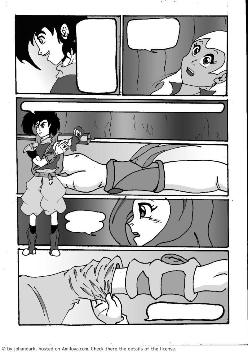
Johandark, please be more careful when adding the balloons > here the text is getting out of the balloons. ?
?

TroyB 08/23/2011 11:36:35It's really better for readers when it's nicely fitting, don't you think
By the way, you should also not put the text in capitals... keep capitals for SHOUTINGS
著者
TroyB のコメント:Johandark, please be more careful when adding the balloons > here the text is getting out of the balloons. ?
?

johandark 08/23/2011 12:01:42It's really better for readers when it's nicely fitting, don't you think
you have completely the reason. I try to do it better xD
TroyB のコメント:By the way, you should also not put the text in capitals... keep capitals for SHOUTINGS
In this case is a little bit more complicated...
For Shoutings I don´t prefer capitals, You can do a Loud Shout with no Capital Letters... what matter for a Shout is the size of the letter.
For comics is much better write everything in Capital Letters.
It´s much more easier to read.
But as Scott Mcloud said in his revolution in comics.. this is hard to decide.. jeje. But all time in comic world had been used Capital letters... and they worked... why change what it worked for so long time then?... mmm
as I said... it´s complicated... jaja
 ?
?

 .
.
TroyB 08/23/2011 14:04:52TroyB のコメント:Johandark, please be more careful when adding the balloons > here the text is getting out of the balloons.
It's really better for readers when it's nicely fitting, don't you think
johandark のコメント:
you have completely the reason. I try to do it better xD
OK good, this specific comic has lots of positioning issue, that's sad because it's degrading your comic.
johandark のコメント:
TroyB のコメント:By the way, you should also not put the text in capitals... keep capitals for SHOUTINGS
In this case is a little bit more complicated...(...)
But as Scott Mcloud said in his revolution in comics.. this is hard to decide..
If Scott McLoud said it... 'Amen' then
著者
TroyB のコメント:OK good, this specific comic has lots of positioning issue, that's sad because it's degrading your comic.

johandark 08/23/2011 15:43:21Yeah... You´re right... This comic is nod made by computer... it´s dirty... and a lot of things more... xD
But i just want to do an experiment with it... just to know the opinions of the people...
Is a comic that I did in four years and nobody in the world has ever seen this... (and it has more than 100 pages... xD).
Thanks for your advices
johandark のコメント:

Robot Panda 08/23/2011 14:09:41But as Scott Mcloud said in his revolution in comics.. this is hard to decide.. jeje. But all time in comic world had been used Capital letters... and they worked... why change what it worked for so long time then?... mmm
as I said... it´s complicated... jaja
Oh, true it is hard to decide, but it comes down to font really. For example if you're using font like Anime Ace, or Komika or something, that is all caps by default, letters look nice in caps, but with the translator's Arial or something, they may look better on the site if you write them normally, which is what matters for now.
Anyway, keep it up, man!
著者
you caught me there,I had not thought about the "fonts". But about that matter, we have to consider that a comic have to be comfortable even reading it in far distances or small letters, and above all quick to read. (and bearing in mind that the lines of text in speech bubbles are no more than three lines) Capital letters are faster to see and are more understandable.
johandark 08/23/2011 15:40:09The capital letters regardless of the type. are faster to read from greater distances.
small letters were made for a better reading of great stories or Fat books.
But it is true that the letter "Arial" ... Both reads well in small letters and capital letters.
...
...
Ok... I have to admit one thing... is faster write in small Letters... (Mostly because Google Translate doesn´t understand well Capital letters)... and watching that i´m one versus two... and you are the bosses ... I will do what is faster xD.
Thanks for all xD